TOGETHER WE SHAPE TOMORROW
On 2022 different groups, teams and competencies within Bosch were rearranged and merged into a new unit: Bosch Digital.
They asked us to develop a characteristic Visual Identity for the unit that would stay true to the main Bosch brand.
KEY VISUALS AND MERCH
All the previous elements come together in key visuals, templates and merchandising pieces that the employees will use and enjoy in their daily tasks and working days. Such as social media and Powerpoint templates, Microsoft teams backgrounds, stickers, flags, fair and events merchandising, etc.
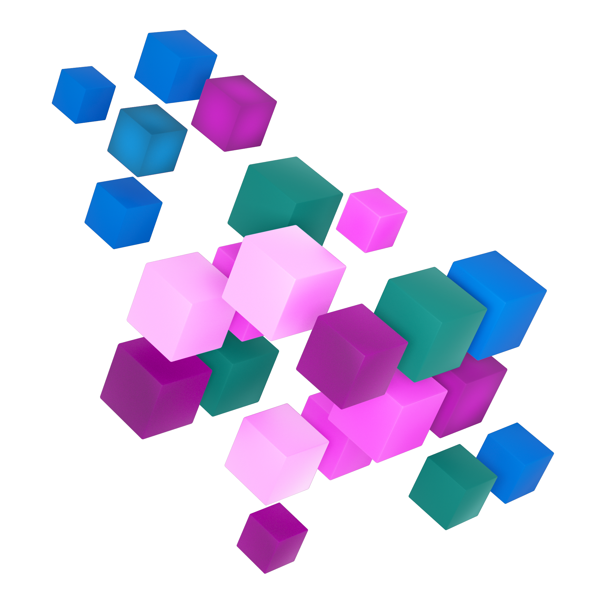
The Secondary Design Elements | The Cubes
The hero-visual of the cubes is a visual metaphor of what the Bosch Digital stands for:
it is digital, therefore the square pixel shapes,
Bosch digital as a unit within the whole Bosch ecosystem.
Bosch’s knowhow and history of the brand bringing together the future of Bosch.
The Logo
Using the Bosch Sans font with some known elements from coding language like the symbol “_“ we built a simple logo for the unit.
The colours
White and Dark grey were chosen as background colours in relation to the “Dark or Light” modes in digital interfaces.
For the highlighted elements colour palette, 3/4 of the Bosch main secondary colours were chosen. Those being: Purpur , Blau and Türkis .
The Signet
A unit growing from a pixel. It represents how this digital unit is building something via digital products and digitalization. “We are digitals” is the main claim of the team.
APPLICATIONS
Our task included not just the development of the unit’s distinct visual elements but also ideas of how they could be animated. Here is an example of an animation where the logo and the main design element, the cubes, interact for a Linkedin post.


